- October 6, 2014
- by Nick Campbell
- Freebies, Web Design
- 0 Comments
Are you one of those designers who have their favorite fonts and don’t stray from them in all your projects? It doesn’t have to be like that. How do we know you so well? Probably because we have all done it at some time: we get in a design comfort zone and don’t want to take the time to find something new and interesting.
Well don’t worry, if you are reading these words you are most likely a daring artist rather than a copycat busy with cloning the same design patterns. We don’t think a detailed lecture on the importance of typography is exactly what you need at the moment. We would like to offer you something much more practical instead.
What about a collection of free, commercial use fonts with a 1 user license? Are you interested? Let us sweeten the deal for you by revealing the information that all free fonts in this collection are available in OpenType format and are cross-platform compatible to work on both Windows and Mac computers. Don’t you think that it’s high time to view what else is in store for you? Stay with us; you will find it fun and utterly useful!
So much has already been written about typography, its tips and importance in print and online design. We will try to surprise you anyway.
What would you answer if somebody asked you why typography is so significant in design?
We would suggest the following:
- Typography should be considered as an art of arranging type.
- Typography includes such substantial elements as typeface choice, color palette, point size, line length, design integration and the whole layout.
- Main purpose of typography is not only making a design attractive, but easily readable!
- Typography can help communicate a visual summary of the print or online design.
- It’s very important for company branding, and with logo design.
- A properly styled typography set can gently guide a person through a design layout, or a a website visitor through your online content.
- Typography differentiates your content from others.
- The right choice of typography gives a consistent look to a design, or a website (which enhances UX).
If you have no objections, we will go on.
Want to impress the users with your typography? Stick to these simple rules.
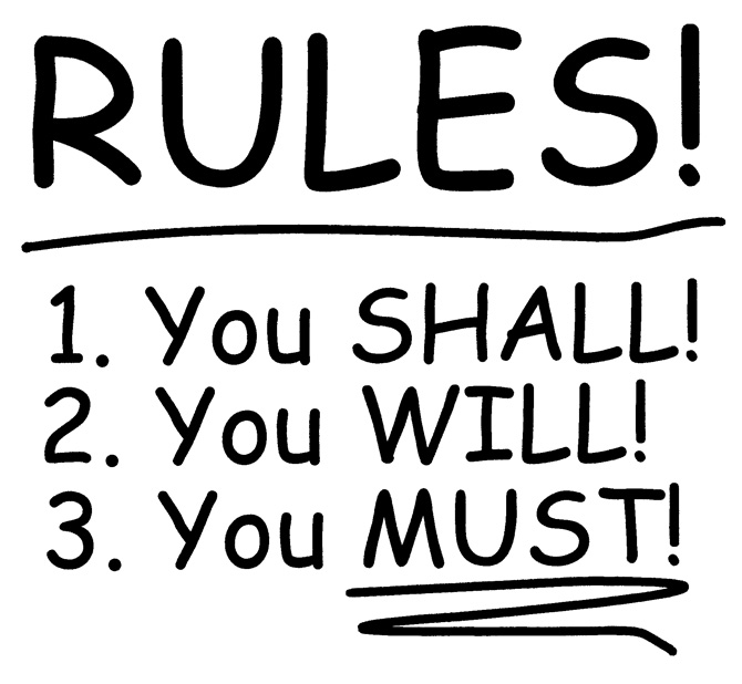
Establish a typographic hierarchy. Provide a clear heading, subheading and body text. Each should be clearly indicated through the chosen font and additional hooks such as bold, italics, and underline.
- Choose an appropriate font for the body text.
- Leave your text some room to breathe. However, ‘rivers’ of white space running through the middle of the text make it hard to read. Try to achieve nice clean rags instead.
- Try to limit paragraphs to 40-60 characters per line.
- Make sure that there is a good contrast between text and background.
- Know your font families.
- Combine a sans-serif font with a serif font; combine a serif font with a san-serif.
- Stick to two fonts. Only go for three if you must.
- Combine fonts of complimentary moods and of similar time eras.
- Use different weights of fonts in the same family.
Typography crimes to avoid

- Combining two similar fonts.
- Mixing different moods.
- Tiny text.
- Too many different fonts on one page.
- Continuous use of all caps.
- Large amount of centered text.
- Extra leading.
- Negative leading (good leading is 1,25x of the point size).
- More than 3 font families in a design. (Actually one is perfect if that’s possible).
- Serif typefaces in headings.
- Lines longer than 15 words.
- Not following the trends. There are fonts which are universally known to be unpopular or overused (we are talking about you Comic Sans, Arial, Times New Roman and Helvetica!). It’s so easy to find new, fresh alternatives to the moth-eaten fonts on the web.
- Not using web fonts. What’s the point of picking a perfect font if no one but you can view it? Standard web fonts are already installed on the end-users’ PCs, so they will be able to read your message by all means.
- Using fonts that were designed for another purpose. It is recommended to choose bolder, more noticeable typeface for headings (a sans-serif or decorative font). Serif fonts are the ideal option for body text as they are readable better in bulk.
- Stretching or squeezing the font to make it fit into your designated space. Just find other alternatives; otherwise you’ll have a problem.
- Using too many signals (italics, bold, caps). They should emphasize only the most important parts of your content or you’ll confuse the user.
- Orphans and windows. Not sure what we are talking of? Let us clarify the terms for you. Orphans are single words that appear on their own and take up a whole line. (They look awfully messy.)
- Windows refer to a single line from a paragraph carrying over to a new column. (It also looks messy and can be hard to read when the end of the section is carried over to the next).
* * *
- If you write something feminine, use Isadora, for instance.
- Convey humorous text with Comic Sans at your own risk or similar styles of fonts.
- Helvetica is used worldwide for signage.
- Need a classic look? Try Garamond. It was designed in France almost 500 years ago.
Have you had enough of typography tips and tricks?
Then, it’s time to move further. Are you ready to add a new resource where you can find a vast collection of awesome commercial use fonts for your designs? Of course you are if you’ve already taken the time to read this.
So, what is so special about MacAppware and how you can benefit from what they have to offer? The collection of free fonts at MacAppware continues to grow larger every few months (they started with 10 free commercial use fonts a few years ago and now have 515 total fonts). Check out this resource, find out more about the team and their work. We don’t think that you’ll regret about that.
* * *
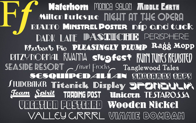
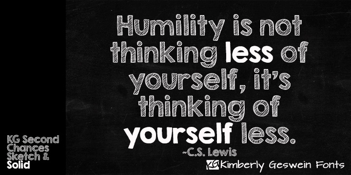
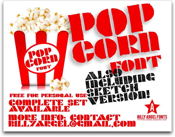
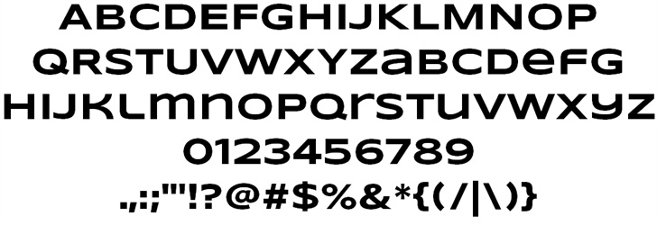
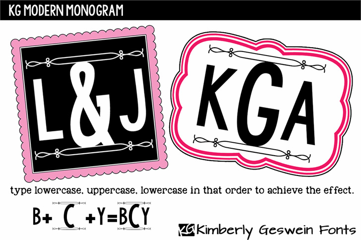
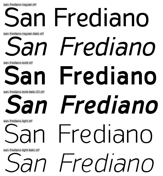
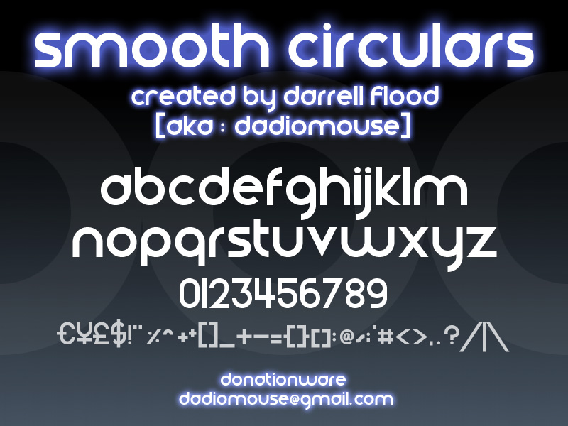
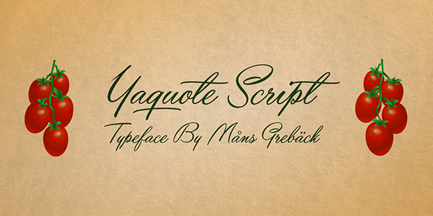
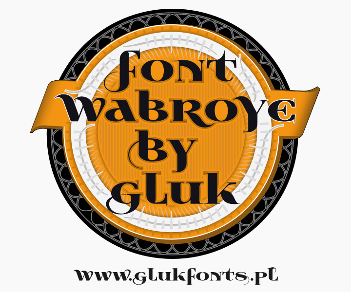
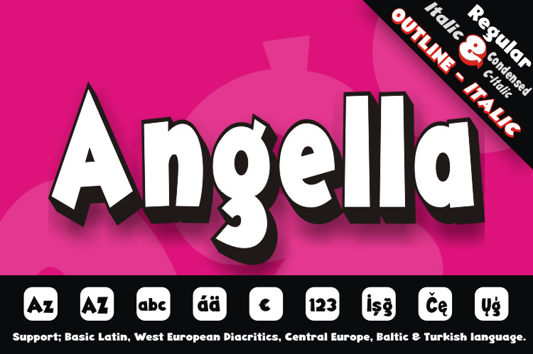
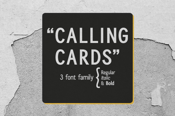
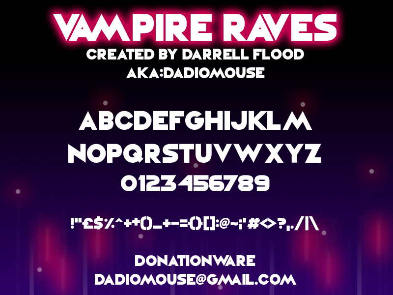
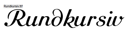
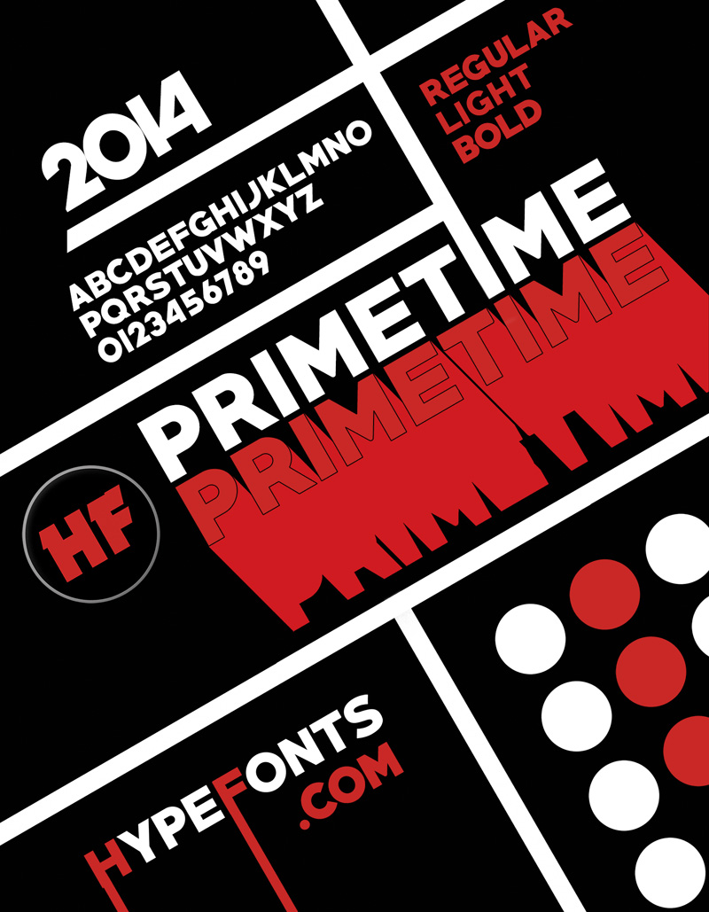
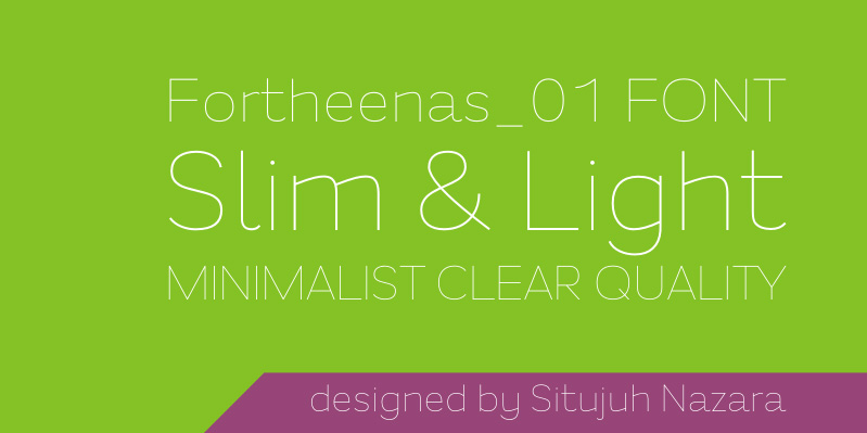
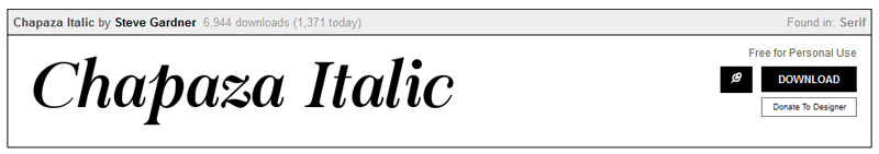
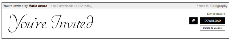
Here are some more free trendy fonts from other resources for you to compare.
* * *

* * *
* * *
* * *
* * *

* * *
* * *
* * *
* * *
* * *
* * *
* * *

* * *
* * *

* * *
* * *
* * *
* * *
* * *
* * *
* * *
Conclusion
The main thing with typography is to play around with it a bit: not to use the same fonts for every design project, do your research, and choose fonts and styles which match the layout without being unreadable and ruining the end-user experience. This simple technique will always keep your designs and text looking fresh and attractive.