- October 13, 2022
- by admin_
- Miscellaneous
- 0 Comments
Data visualization involves the conversion of data or information into a graphical form so that users can understand the trends and ideas contained in the report. To convert data into a visual you can use various methods. The number of data visualization tools and libraries has even gone up over the past five years. WordPress is one of the best tools that you can use to communicate your ideas and concepts better to your readers. The focus here is to use the data presented in a visual form to pass on information rather than just dumping the data to your website visitors.
In this article, we are going to show you how you can do data visualization in WordPress.
Ways in Which Data Can Be Visualized in WordPress
Simple charts and graphs
Doing simple charts and graphs is one of the simplest ways in which you can begin your data visualization with WordPress. You can either do a pie chart or a bar graph. In the end, your readers will comprehend whatever information you are trying to communicate with ease.
Under simple charts and graphs, you can visualize data in the form of line graphs, pie charts, bar graphs, and area graphs. Pie charts and bar graphs can be used to do comparisons between various groups over time, while line and bar graphs can be used to show changes between groups over time.
Comparison tables
When you are comparing various entities, using comparison tables to visualize data is the best way to pinpoint crucial variations between the entities. If, for instance, you are comparing two plugins, tables can be great as they assist the reader in picking the best tool with ease. Readers can easily note differences in the various functionalities of the tools.
Pictorials
Pictorials usually involve visualizing data in both graphical and chart forms. This way, data is enhanced by putting an additional image or icon connected to the information being communicated into the chart presentation.
Infographics
For a while, you can use infographics as a link development strategy, but can also be of assistance in creating data visualization stories. With Infographics, you can visualize your data using several data visualization methods all flowing together to convey the same information. Data visualization experts from service providers like activewizards can help you present your data in multiple visual forms.
Timeline with events
Timelines with event visualization use both line and area graphs with particular events. Here the focus is not only on communicating the changes that have happened with time, but also marking the specific events in the presentation that caused the changes.
Map visualizations
When it comes to communicating data on a particular location, map visualization is the best way to do so. With maps, you can easily highlight the data density of a particular geographic location. You can shade the location with a particular color with each color representing a specific factor or numerical range.
WordPress Data Visualization Plugins and Tools
Elementor Widgets – Stratum

3bit Booking Plugin for WordPress

Zemez Responsive Navbar JavaScript

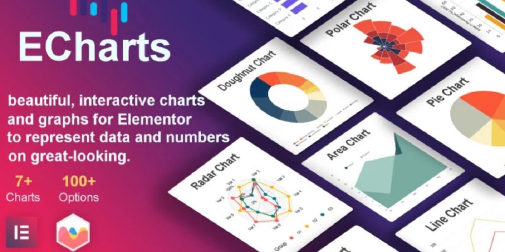
ECharts – Charts & Graphs WordPress Elementor Plugin
FoodMan – Delivery System WordPress Plugins

WooLive – Livecall WordPress Plugins for WooCommerce

WordPress Hotel Booking Plugin
