- November 9, 2015
- by Nick Campbell
- Graphics, Web Design
- 0 Comments
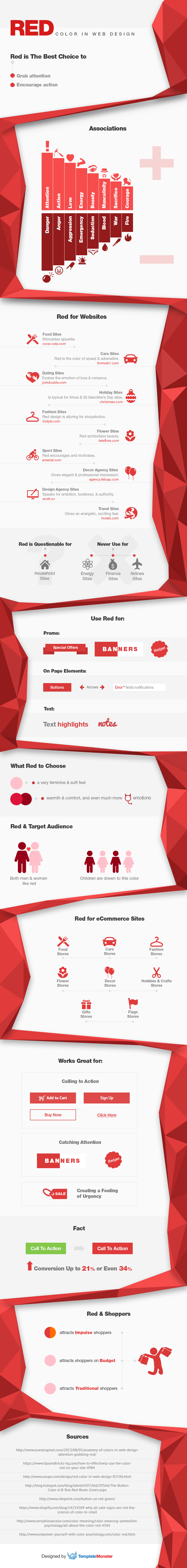
Use of colors is an important aspect of any design, be it a brand logo or UI interface. Each color can have its own psychological impact on viewers, so it’s important to choose the palette for your project thoughtfully. The most powerful color in terms of psychology is proved to be red, and today we’d like to show how you can benefit from it. Spend a few minutes to explore a brand new Infographic of Red Color in Web Design. This brainchild of the TemplateMonster team is focused on the influence of red on the customer behavior and highlights a number of guidelines on how to use it properly.
Thinking about red, we perceive it as one of the most intensive colors, 100% eye catcher and powerful expressionist of feelings and emotions. Such qualities make it a primary color for conversion-oriented sites, especially online stores. Red is commonly used for a variety of UI elements, from promo banners and important text messages to call-to-action buttons and badges notifying customers of sales. Thanks to red, they can turn from humble, unnoticeable elements into attention-getters and become the first things coming into focus when buyers enter an eCommerce site.
Similarly to other colors, red comes in a variety of shades, each of which communicates its own ideas. For example, light red expresses tenderness and femininity, whereas dark red is associated with something more brutal and even sinister. Make sure you pick the right shade for your UI elements if you want to attract a specific category of clients with maximum efficiency. Keep in mind that overuse of red can push viewers away, that’s why it’s crucial to combine it with other colors. Designing an interface pleasant to the eye must be your top priority.
Before proceeding to the Infographic of Red Color in Web Design, scan a checklist of the major issues featured there. They are as follows:
- mental associations that red brings;
- kinds of websites to use and avoid this color for;
- UI elements to apply red to;
- shades of red;
- target audience divided by the sex and age;
- red for eCommerce sites;
- purposes of using this color;
- kinds of shoppers depending on the red shade;
- list of the sources used to create the Infographic.
Enough of previewing the Infographic of Red Color in Web Design, time to explore it!
* * *
In conclusion, we’d like to mention that “Red Color in Web Design” is not the first TemplateMonster Infographic related to the color psychology. A few years ago, the company’s team released Mysterious Black and Coolness of Blue Infographics, and now they seem to have restarted the series. The next Infographic is reportedly to cover the issues of using green in web design. So, don’t forget to visit our blog and learn how to take advantage of green and its shades on your site. Feel free to share your impression about the Infographic featured in this post and possibly some other curious facts of red in the spheres of marketing and eCommerce!