• Home
  • Website Templates
  • Services
  • Blog
  • About Us
  • Contacts
  • Home
  • Website Templates
  • Services
  • Blog
  • About Us
  • Contacts
  • Home
  • Website Templates
  • Services
  • Blog
  • About Us
  • Contacts

How to be Prepared for Google’s Mobile-Friendly Update

  • Home
  • News
  • How to be Prepared for Google’s Mobile-Friendly Update
  • April 15, 2015
  • by Nick Campbell
  • News, Web Design
  • 0 Comments

Move over Panda and Penguin, there’s a new algorithm update in town. Google has yet another surprise up its sleeve, and this time it is going to be apocalyptic.

Once  April 21 arrives, websites worldwide are going to undergo the test of their lives. Only those which have been optimized for mobile devices will emerge unscathed. They are calling it the ‘Mobile Friendly’ algorithm update. And believe me, the impact is going to be huge.

Basically, this is what’s going to happen:

With the number of mobile-only Internet users worldwide sky-rocketing to over 780 million, Google decided that it was time to take user-experience to the next level. The focus is to provide mobile users with a better search experience. With the ‘Mobile Friendly’ algorithm update, Google is making major efforts to tailor its search results to favor websites which have been optimized for mobile use.

In other words, if your website isn’t mobile-friendly, your ranking in the SERP (Search Engine Results Page) and eventually, your website traffic is going to take a massive blow.

With Google dominating a 75% share of the search market, unresponsive website owners can already smell the bitter aroma of catastrophe.

‘Mobilegeddon’, some have named it.

Is your website ready for the new update?

google-responsive-design

Have you been sticking to the old-school website design practices for the past decade? Google has been quite the gentleman this time and given you a heads-up to upgrade your website and optimize it for mobile devices. So lose the panic-stricken look and get busy.

Here’s what you can do:

1. Find out if you are in the danger zone

There are two things you can do:

First, run your website through Google’s Mobile-Friendly Test. If it comes up with a green “Awesome! This page is mobile friendly”, then you are all clear. If you get a red “Not mobile friendly”, then you have got some work to do.

Even though this might sound pretty flawless, it is never wrong to check and re-check.

Second, search for your website on your mobile device. If the SERP entry bears the “mobile friendly” label, then you are safe.

2. Utilize Google Webmaster tools to check your mobile usability stats

google-mobile-usability

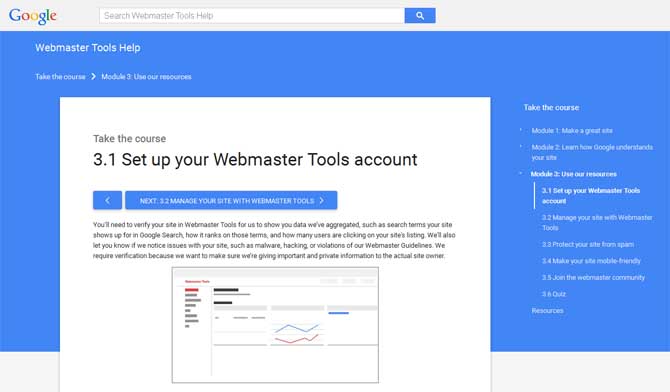
Assuming that you already have set up your site with Google’s Webmaster tools, it is time to identify the problem. The dashboard is going to be your guiding star through the specific issues that are stunting your mobile-friendliness.

Clicking on the usability errors will take you directly to the page with the issue. It could be anything ranging from a simple font issue to a complex screen-view one.

Fix it.

3. Test till you drop and test once more

Testing has been known to save hundreds of websites. Yours could be one of those too.

Every time you make a tweak, test.

Take a test run through every page of your website and make sure that the pages are loading properly and the links are working. Run the test on your smartphone to be extra sure. By the end of it all, your website should be up and running smoothly on a mobile device.

A few tips and tricks to help you along the way

Your primary goal here, as with every other algorithm update Google rolls out, is to make your users happy. If you can achieve that, Google will reward you.

That being said, you might already have an upgraded mobile optimization strategy devised and running to maintain versatility. If this is the case, then you are all set. If not, then we have a few more actionable tips for you.

Let’s have a look.

  • You do not need to be a rocket scientist to know that a mobile screen is smaller than a desktop. Therefore, your text size needs to be big enough for users to read on a mobile device.
  • Display the most accessed content of your website prominently. If the blog section of your website has been fetching the most views, put it up front.
  • Not all of us are blessed with thin fingers. Make sure to space out the links in your website to accommodate every finger size. You do not want users to get annoyed with the frustration of tapping on one link and watching a whole different link open up.
  • Your website layout should not stretch far beyond the mobile screen size. Users find scrolling left and right to be pretty distracting.
  • Employing a responsive template is an easy way out.


Keep a tab on everything that you need to know about this exciting update and implement the adaptations necessary. Remember, at the end of the day it is all about how useful your website turns out to be.

ABOUT THE AUTHOR

Eric Haskell has over 15 years of experience in web development, programming, e-commerce, and business strategy experience. He focuses on solutions that merge current technologies, applications, and concepts together to help each client meet their goals with success. He also contributes articles for Palmetto Web Design, Columbia SC.

Previous

Top 5 Mistakes to Avoid While Creating Responsive Design

Next

Hot Sale of Premium Templates: 40% Discount for Everything

Leave a Comment

You must be logged in to post a comment.

Categories

  • Free Website Templates (207)
  • Freebies (74)
  • Graphics (18)
  • HTML5 (39)
  • Joomla (23)
  • Magento (8)
  • Marketing (8)
  • Miscellaneous (43)
  • News (53)
  • Opencart (2)
  • PrestaShop (3)
  • SEO (22)
  • Shopify (2)
  • Tutorials (15)
  • Web Design (52)
  • Website Templates (37)
  • WordPress (28)

Recent Posts

website redesign
May 19, 2025
Website Redesign Checklist: What to Fix
Multilingual WooCommerce Store
March 18, 2025
Creating a Multilingual WooCommerce Store
WordPress themes
February 8, 2024
Transform Your Site with Top-notch WordPress

Tags

black business template business templates discount discounts download download free templates Facebook Facebook Template Facebook Templates flower flower template flower templates flower website template flower website templates flower web template flower web templates Free freebies Free Hosting Website Templates Free Template free templates free website template free website templates Free Web Template Free Web Templates green Halloween Hosting Website Templates icon icons love sale templates the color purple Valentine's Day web design web design freebies web icon web icons website flower templates Website Template Website Templates Web Template Web Templates
  • shape1
  • shape2
  • shape3
  • shape4
  • shape5
  • shape6
  • shape7

Newsletter SignUp!

    About Us

    Free website templates are a reasonable solution to starting your own online business. Today you are lucky! Meet WebsiteTemplatesOnline.com - where renowned web designers share their website templates for free!
    Email: [email protected]

    Free Templates

    • WordPress Themes
    • HTML5 Website Templates
    • Shopify Themes
    • WooCommerce Themes
    • Landing Page Templates

    Useful Links

    • Website Templates
    • Services
    • Blog
    • About Us
    • Contacts
    © WebsiteTemplatesOnline 2022. All Rights Reserved.Theme Technologies LLC, Serial Number: 78612360Privacy Policy. Terms of Use
    • Home
    • Website Templates
    • Services
    • Blog
    • About Us
    • Contacts
    Follow Us
    • Home
      • Home
      • Home 2
      • Home 3
    • About
      • About Us
      • About Us 2
    • Case Study
      • Case Study 1
      • Case Study 2
      • Case Study 3
      • Case Study 4
      • Case Study 5
    • Elements
      • Blog
        • Blog Post 1
        • Blog Post 2
        • Blog Post 3
        • Blog Post 4
        • Blog Post 5
        • Blog Post 6
      • Service
        • Service Gallery 1
        • Service Gallery 2
        • Service Gallery 3
        • Service Gallery 4
        • Services
      • Team
        • Our Team
        • Team Gallery 2
        • Team Gallery 3
      • Testimonial
        • Testimonial – 1
        • Testimonial – 2
        • Testimonial – 3
      • Contact Info Box
        • Contact Info Box 1
        • Contact Info Box 2
      • Info Box
        • Info Box 1
        • Info Box 2
        • Info Box 3
      • Miscellaneous
        • Brand Showcase
        • Counter 1
        • Progress Bar
        • Progress Box Image
        • Radius Button
        • Section Title Subtitle
      • Pricing
        • Pricing Plan 1
        • Pricing Plan 2
        • Pricing Plan 3
        • Pricing Plan 4
        • Pricing Plan 5
    • Pages
      • Service
        • Service Archive
        • Single Service
      • Case Study
        • Case Study Archive
      • Team
        • Our Team
        • Team Gallery 2
        • Team Gallery 3
      • Typography
      • 404 Error
    • Blog
      • Blog 1
      • Blog 2
      • Blog 3
    • Contacts
    Follow Us

    We are using cookies to give you the best experience on our website.

    You can find out more about which cookies in our Cookie Policy we are using or manage them in settings.

    Powered by  GDPR Cookie Compliance
    Privacy Overview

    This website uses cookies so that we can provide you with the best user experience possible. Cookie information is stored in your browser and performs functions such as recognising you when you return to our website and helping our team to understand which sections of the website you find most interesting and useful.

    Strictly Necessary Cookies

    Strictly Necessary Cookie should be enabled at all times so that we can save your preferences for cookie settings.

    If you disable this cookie, we will not be able to save your preferences. This means that every time you visit this website you will need to enable or disable cookies again.

    3rd Party Cookies

    This website uses Google Analytics to collect anonymous information such as the number of visitors to the site, and the most popular pages.

    Keeping this cookie enabled helps us to improve our website.

    Please enable Strictly Necessary Cookies first so that we can save your preferences!

    Additional Cookies

    This website uses the following additional cookies:

    • Facebook, Pinterest, and other social media cookies;
    • Google Ads, Analytics, and related websites.

    Please enable Strictly Necessary Cookies first so that we can save your preferences!

    Cookie Policy

    More information about our Cookie Policy